
I have been trying for a little while now to make a video about how I tackle making box cards...well, I finally uploaded one to my YT channel, but it's not as polished as I would have liked. I actually ended up with about seven videos before I managed to get one I was reasonably happy with, but it still took a lot of editing. The main problem was that as I needed to made samples for each video there was a lot of preparation work to do each time...I almost gave up as I seemed incapable of being succinct and informative about the process, but gave it one last try quite late at night and that ended up being the one I went with.
Trouble was I didn't want to do a tutorial, as I really dislike making tutorials where I am seemingly expecting folk to "do it as I do", I would rather just give general comments and plenty of tips and things to avoid and then the viewer can be more creative, using whatever tools and supplies they have available...any how, it is what it is...at least I have got it out of my head now.
Trouble was I didn't want to do a tutorial, as I really dislike making tutorials where I am seemingly expecting folk to "do it as I do", I would rather just give general comments and plenty of tips and things to avoid and then the viewer can be more creative, using whatever tools and supplies they have available...any how, it is what it is...at least I have got it out of my head now.
One positive outcome of this exercise is that I now have several completed box cards, as well as a pile of un-decorated boxes in my project bin :)...not a bad thing.
 Simple sticker box detail | 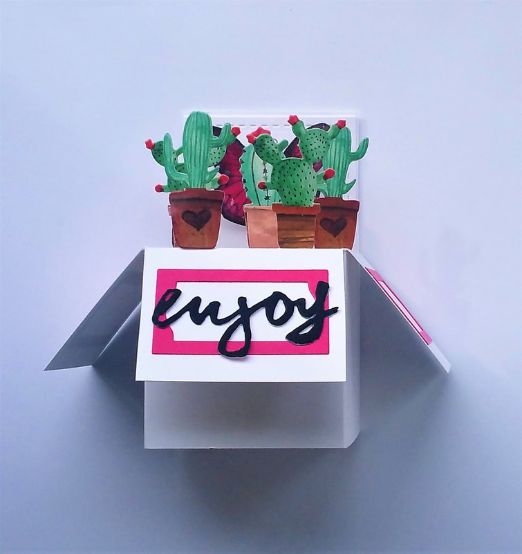 A simple sticker box |
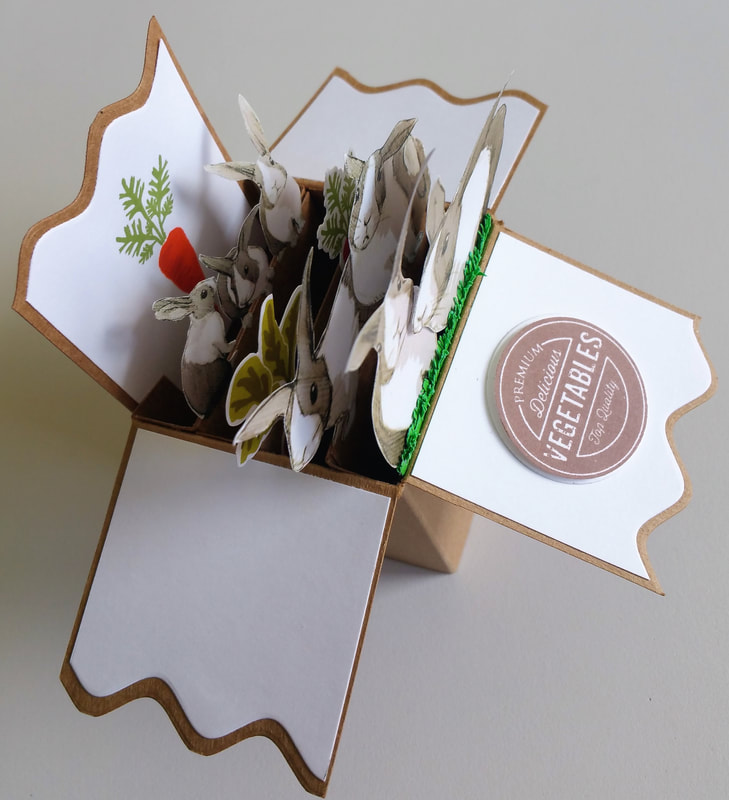 Bunny box detail | 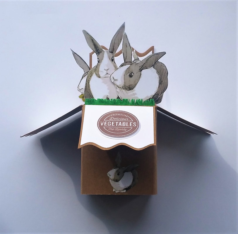 A bunny box for the grandsters |
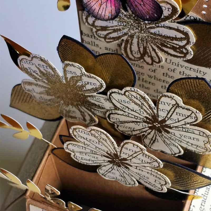 Recycled box detail | 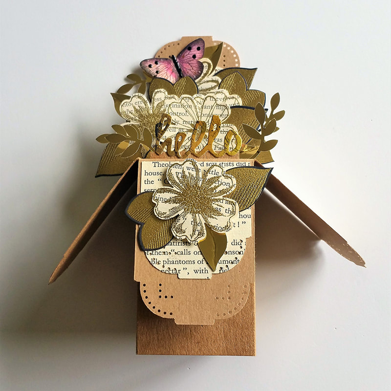 A recycled box for a friend |
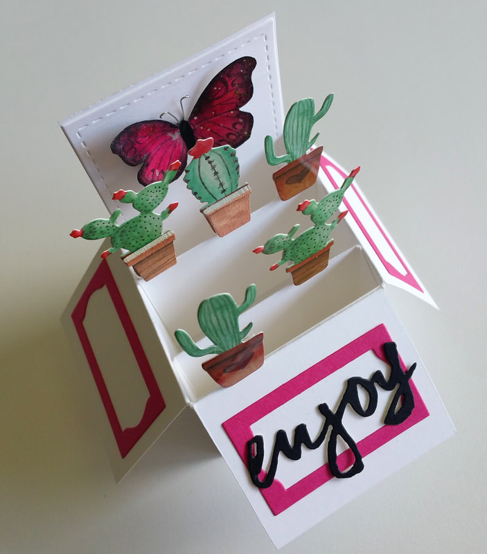
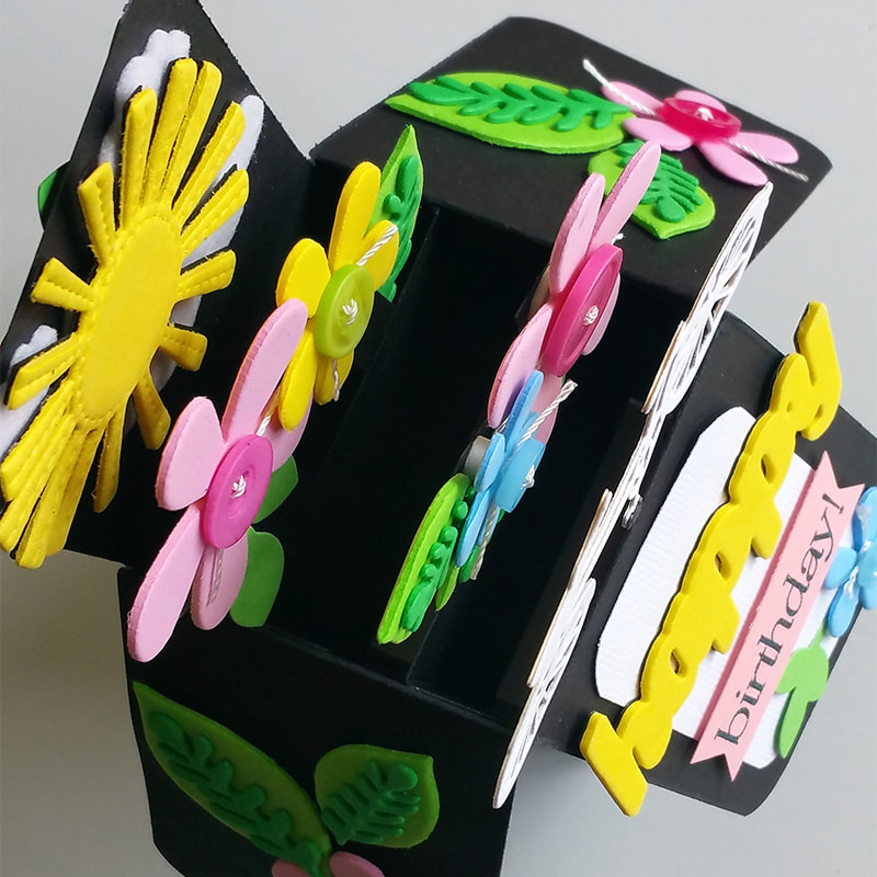 Bright box detail | 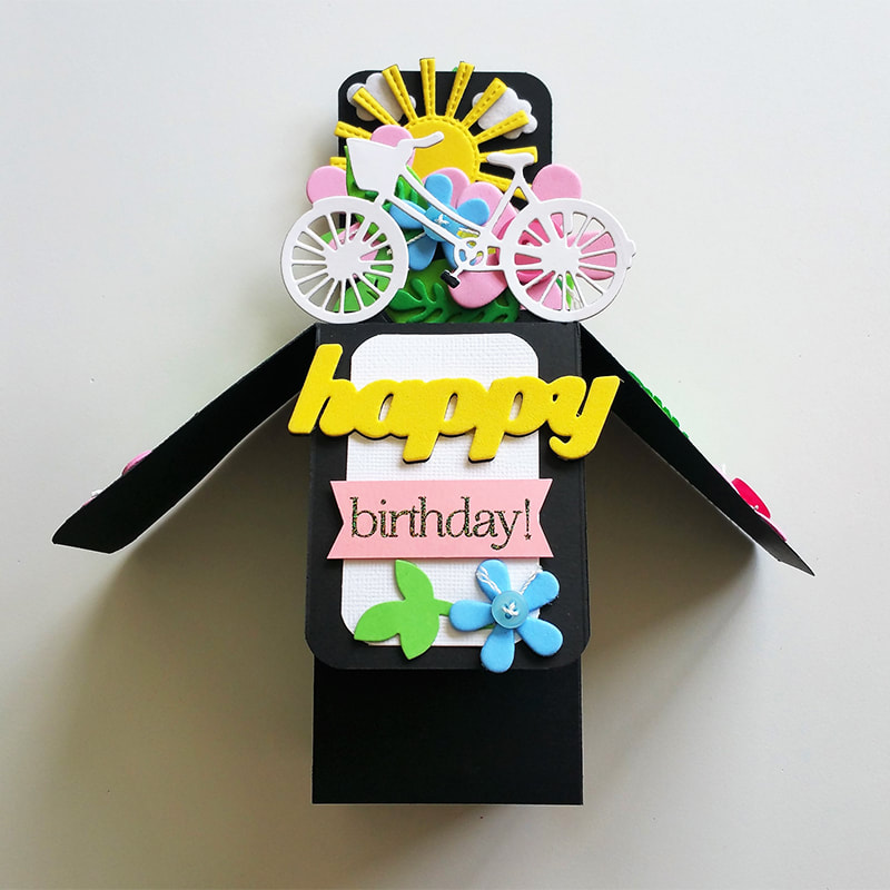 A bright box for a child |
There are plenty more, but I will be kind and not bore you to death...I am sure you will have gotten the gist by now...
During the week I also spent some fun time working with my recently acquired TH Stamp Platform...a wonderful tool indeed. I have resisted until now, following the release of the MIsti and all the lookalikes from other companies...when I saw the Tonic version demonstrated I knew I need resist the purchase no longer...it is a much simpler and seemingly robust tool, to my eye.
I love the way I can now use multi layer stamps with such precision and accuracy, even coming in after I have coloured an image to re-stamp an outline, add heat embossing or a sentiment...
I also found I can make stamped sentiments and watercolour stamping images so much more vibrant and coloured using various inks beside or over each other...I can now get out a lot of my stamps once again, as they have been a tad underutilised recently...
One stamp and die set from Altenew called "Lovely Day" with four- layer rose and three layer leaf images had hardly been used and was a great one to test for accuracy of placement. I had a good try with it during the week. I have several different coloured versions of the flower stamped and die-cut ready to make into cards...I think I will use them as little square note or gift cards...they will be pretty and different to the images I normally use.
I enjoy watching Therese, (LostinPaper blog) and YouTube who make the most wonderful cards, time after time...I get a lot of inspiration from her...like a couple of flower image cards she made recently in a range of grey inks. I don't have anything like her choice of inks and colours, but I found several, with enough contrast to have a good play.
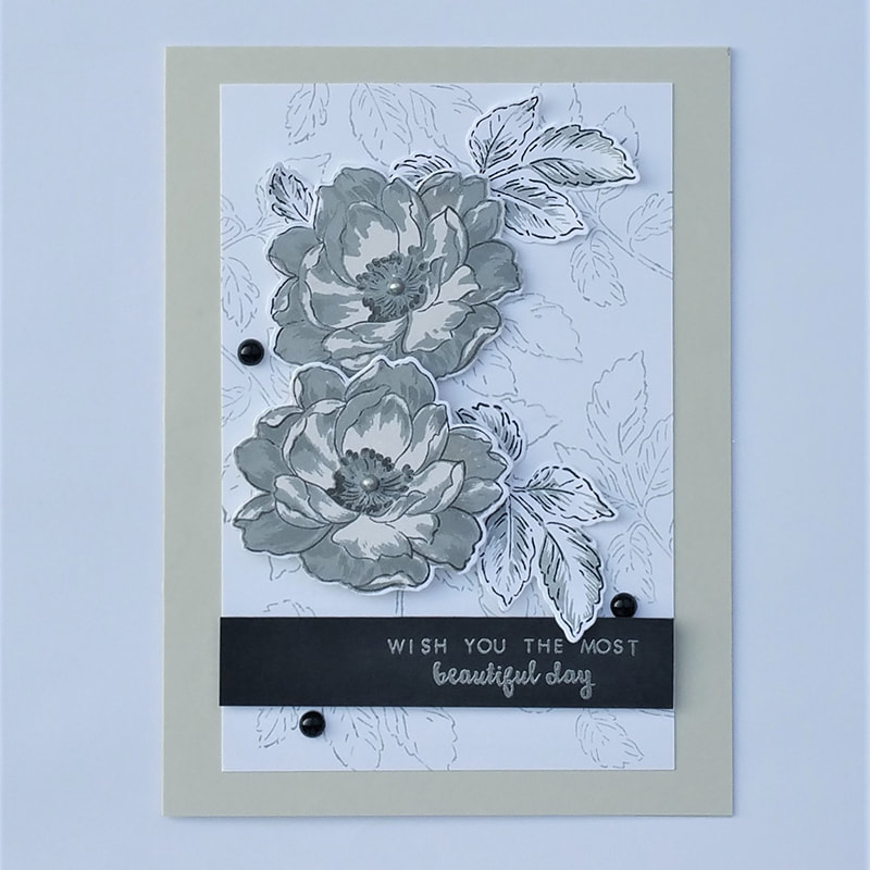
This card has the leaf outline stamped in light grey as a background, the flower in silver and medium grey with "Platinum Planet" and black to add contrast to the outline and black and light grey leaves...
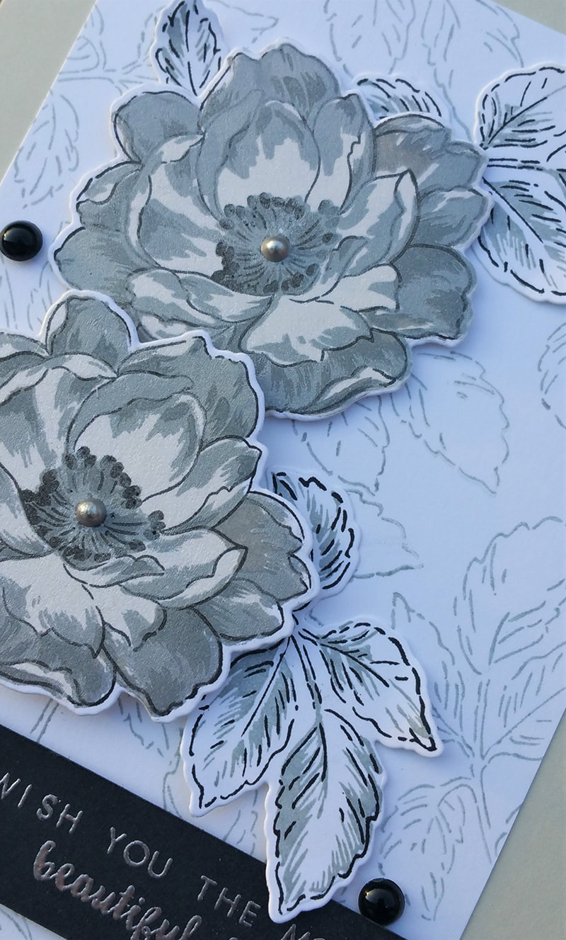
Card detail...
I used the Archival Brilliance "Platinum Planet" Pigment ink as the first layer of the flower just to give me a faintly visible background...being a pigment ink it is a bit of a chore to clean off the stamps but that is balanced with the gorgeous subtle sheen of this ink...
I then (rather disastrously) went on to stamp a heavy silver layer (also pigment ink), over the top, then added a darker grey dye ink...and yes, I ended up with a grey sludgy blurred image...very disappointing.
I gave up then as it was around 0200 hrs. but my brain must have been working on the issue while I slept because I woke with a start about 0400 hours thinking "Let the ink dry between stampings"...I went back to sleep but in the morning I tried that obvious suggestion I had made to myself and yes, it worked a treat...as you can see in the detail photograph, still a bit fuzzy but I like the softness it gives and it is so much better than the original!
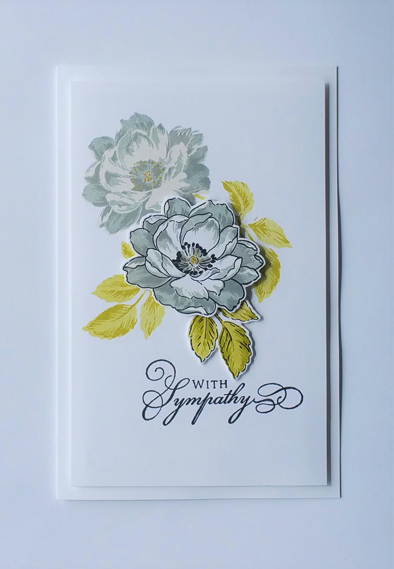
I also made a sympathy card, while I was working with these neutral colours...this time I added some green to the leaves and a touch of gold to the flower centres...
I then (rather disastrously) went on to stamp a heavy silver layer (also pigment ink), over the top, then added a darker grey dye ink...and yes, I ended up with a grey sludgy blurred image...very disappointing.
I gave up then as it was around 0200 hrs. but my brain must have been working on the issue while I slept because I woke with a start about 0400 hours thinking "Let the ink dry between stampings"...I went back to sleep but in the morning I tried that obvious suggestion I had made to myself and yes, it worked a treat...as you can see in the detail photograph, still a bit fuzzy but I like the softness it gives and it is so much better than the original!
I also made a sympathy card, while I was working with these neutral colours...this time I added some green to the leaves and a touch of gold to the flower centres...
We managed to get to Rektango in Salamanca again on Friday evening..it was quite a balmy evening compared to a fortnight ago...very pleasant and the crowd was correspondingly larger so things were very chatty and lively...I had a glass of white wine this time as the mulled wine is made way too sweet for my taste. We left just after seven as the band, Dean Stevenson and the Dean Stevensons, had decided to take a break and we felt a few sprinkles of rain and thought we would go as we hadn't taken any wet gear with us. We chose well because by the time we arrived back at the car it was setting in with earnest...
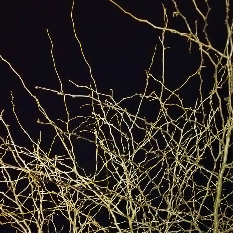
We generally sit on the low wall, under this tree which catches some lighting...it is starting to get some sense of Spring now...leaves won't be long in appearing.
I think that is about enough waffle for today, I have a pile of recycle books waiting for my attention and decision making...I am being ruthless as my crafting space is quite limited...I need to do a relentless hard-hearted cull to free up a couple of Ikea bins for more essential items, plus I need to check on what I really have available to use as things tend to simply get a tad buried...wish me luck,
bye now,
Di
bye now,
Di


 RSS Feed