
Over the weekend I had been out in the garden trimming off the lanky flowering stems of the sage plant. I usually keep these in a vase for a day or two to be able to enjoy the lovely dark purple blue colour. Just after this I was checking out my YT subscriptions and found a video from a few months back by Australian artist Mirjana Psakis on making leaf prints, using...yes...sage leaves!
I couldn't resist trying them. There they were, in my craft room, scenting the air deliciously and right at my hand. I have done several other leaf print projects over the years, with varying success so I knew the technique...sometimes it is nice to go back and revisit older techniques, apply a bit of different thinking to them...that sort of thing.
When making leaf prints, in order to gain a good clear definition, strong veining is useful on the reverse of the leaf is desirable. This is found on even the youngest of sage leaves.
As well, I found that the softness of them allows the painted under surface of the leaf to be gently persuaded onto the paper using the lightest of fingertip pressure. When using firmer leaves, such as currant geranium or eucalypt , it takes firmer pressure to get a successful print...of course it all depends on the look one is after.
I really love the sketchy impression one gets from the stiff waxy surface of a gum leaf and I have been trialling a process using my home made book making press...but more on that outcome later.
For this project I used a dryish water colour paint application onto the back of the freshly picked leaves with a fairly large round soft brush and the heavily veined mono prints that resulted turned out very well indeed, I think.
My water colour tiles are a cheap as chips brand, but even these have given me results with plenty of colour. I also used some Twinkling H2O's, and my gold Gansai Tambi set...these gave beautiful results...
In her video, Mirjana was creating a large watercolour paper print in Autumn colours (as I said the video was recorded earlier in the year), but I stuck with some scraps of smooth water colour paper I had in my scrap bin and mostly greens, blue and purples, although I did add some ochre shades in a couple of places...
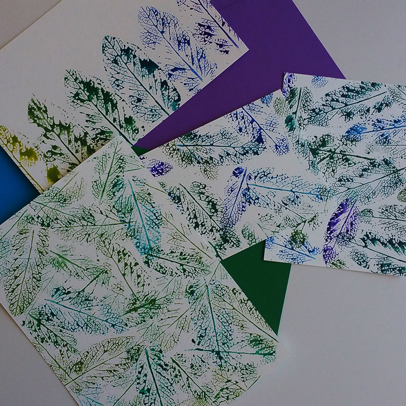
These were the pieces I made first with the plain water colour paint.
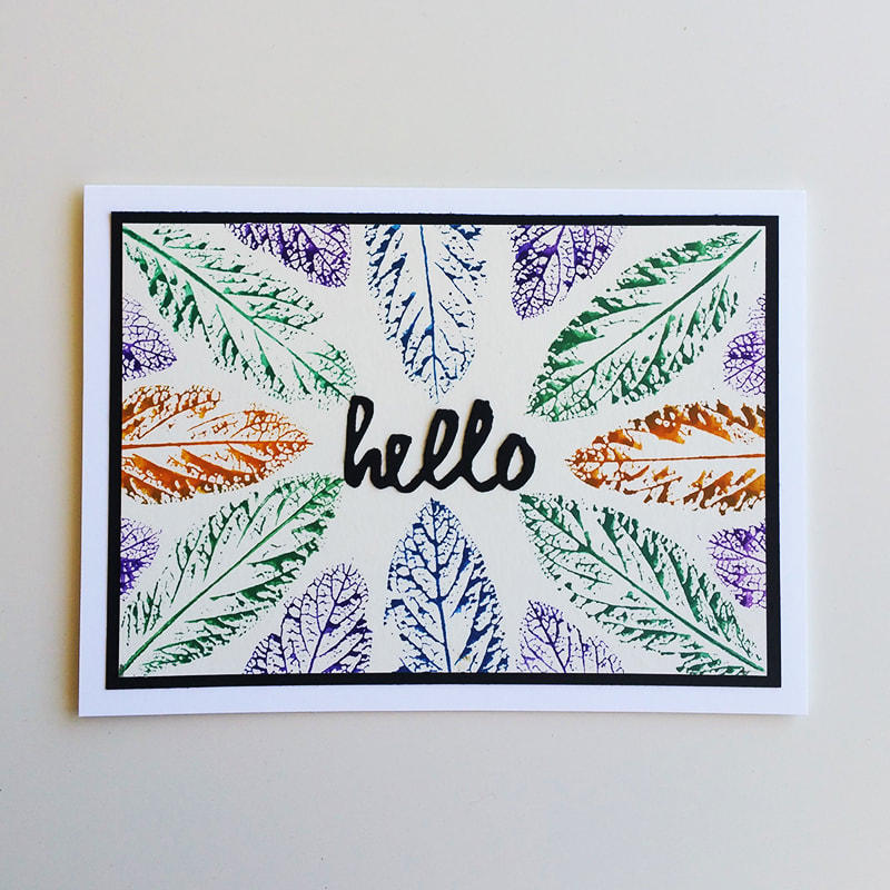
I needed a card for a friend in Sydney that I haven't communicated with for a while...so in this piece I simply worked my way around the perimeter of the water colour paper using different colours of paint...
Instead of using plain water to mix the water colour paints for this little card front, I used some Perfect Pearl powder I had mixed with water for another project...at first I thought that the mixture had not made any visible difference to the outcome, but as soon as I took it out to hold it in sunlight, I could see the lovely gleam of the mica powder shining in the coloured leaf prints...very subtle, but pretty.
I simply matted the card front onto a piece of black card, Added it to the top folded card base and adhered the "hello" sentiment to the centre of the card...nothing fancy here, but it looks quite effective.
I have yet to make the others up into cards, but have sorted out some purple, lime and dark green and ultramarine card scraps to use as mats...I should be able to get about six more cards from this little play session.
For the final piece I used the gold water colours and TH2O pots...These worked brilliantly as far as colour and shine is concerned...I simply had the colour tiles too wet for it to be a good outcome as far as the clarity of the prints was concerned...less is more definitely applies here...the brush needs to be as dry as possible when transferring the pigment in order to give a detailed print of the leaf veining...however, the looser blotchy outcome of having the leaf too wet does have charm also. This trial piece was unstructured in design so I simply used some tag dies and reduced it into the group of little gift tags you see below. These are always useful to have on hand.
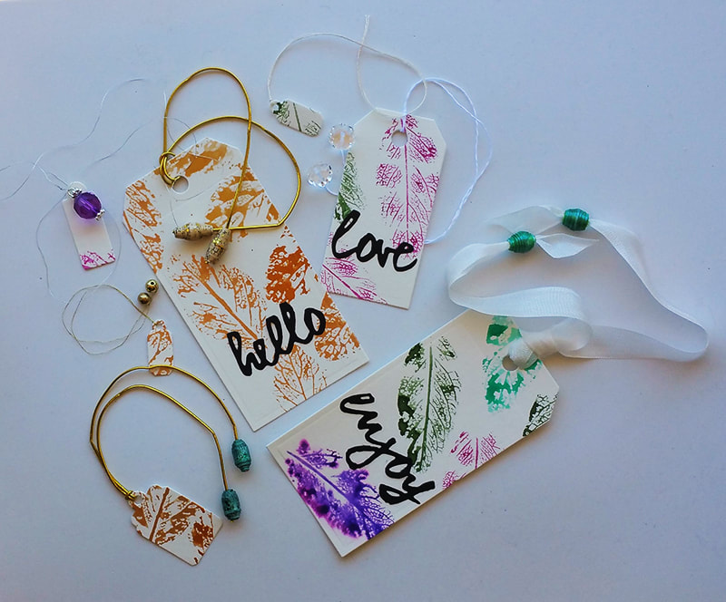
Here are the tags I cut from the practice piece, with beads and strings attached.
Well, that is it for now,
Di
Di


 RSS Feed